Website design inspiration & trends
Preview – Work
Description
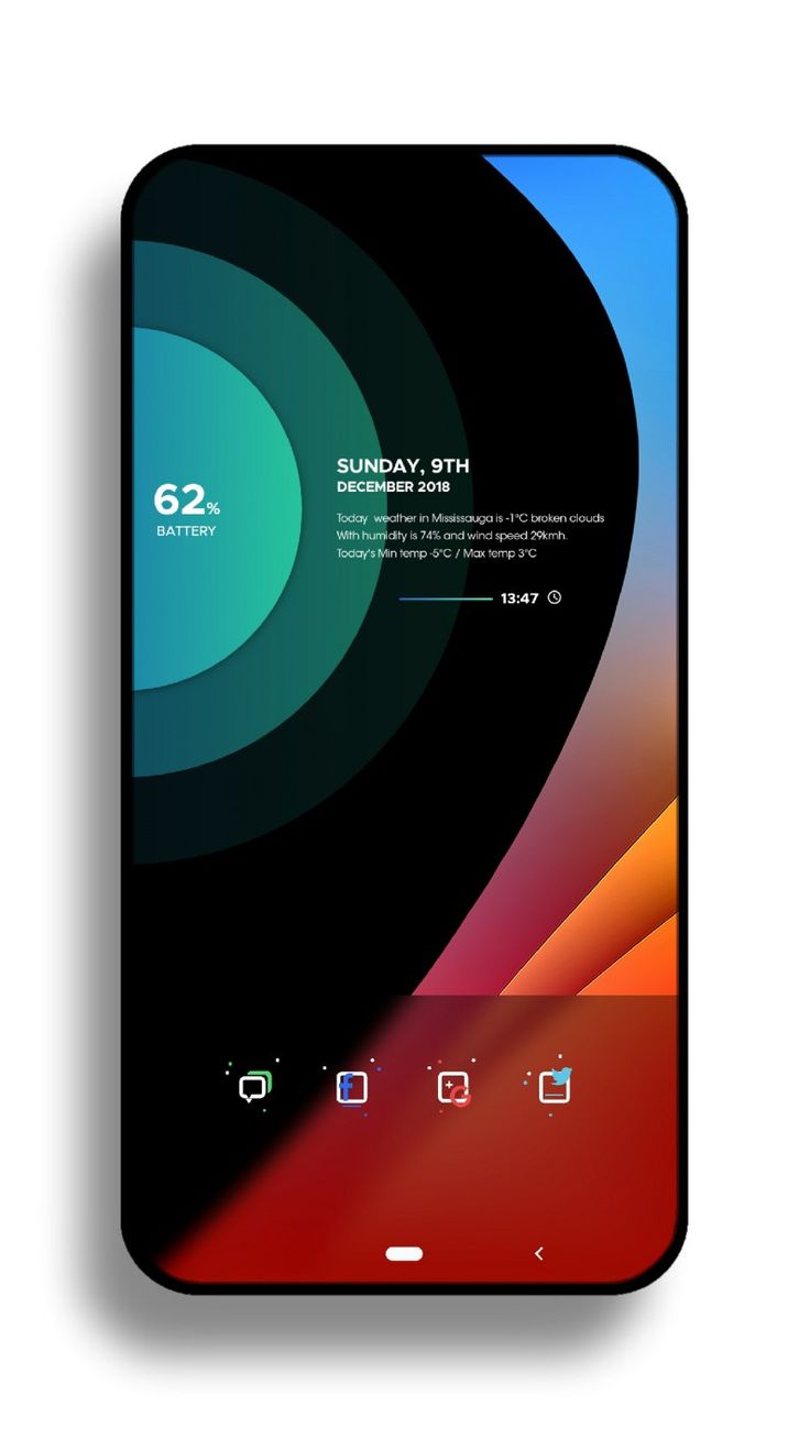
While very pleasant to look at, most people look at their lock screen to check the hour which is very small and difficult to see. The icons on the bottom dock are also hard to comprehend at a glance, especially the google one. That little glitter effect distracts the eyes and the logo part of the icon is very thin and difficult to get. Also kind of a weird location for the battery, will the position be customizable or changing the background will ruin the whole aesthetic?
Discovred by : mich much
– Source –


